Edgecase - AI-Assisted Edge Case & Empty State Generator
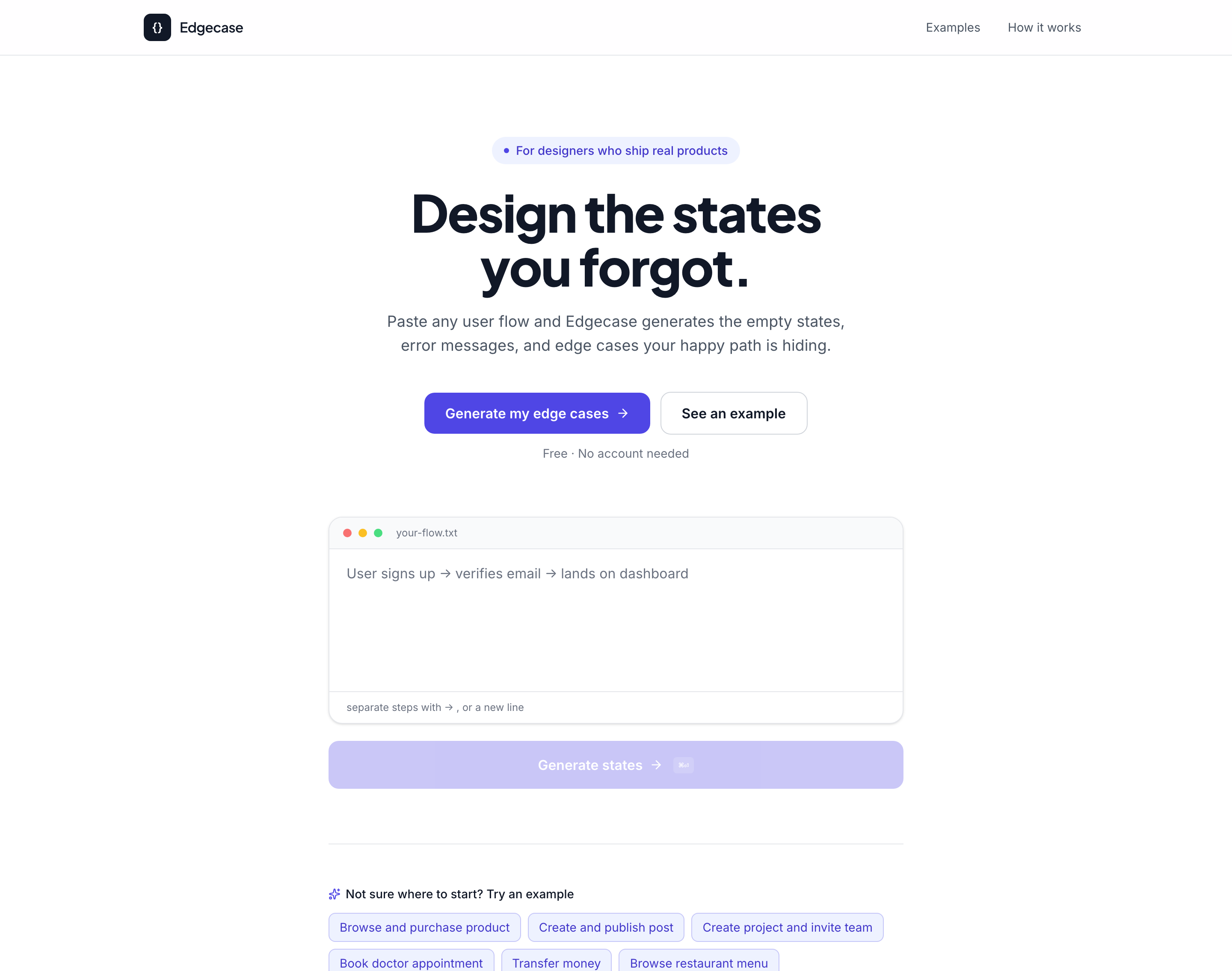
A tool that turns a plain-language description of a user flow into ready-to-use empty states, errors, and edge cases - complete with visual mockups and tone-matched copy, generated instantly. Built solo using AI-assisted development during a one-week Claude hackathon.
The Challenge
In almost every design review I've sat in, someone eventually asks the same question: "What does this look like when it's empty? What happens if this fails? What if someone does this twice?" Too often, the honest answer is "we haven't gotten there yet." By launch, those states either don't exist or get written in the final days of a sprint with placeholder copy like "Something went wrong."
I've watched this pattern repeat across every product I've designed - a government platform used by thousands of people, an AI-powered restaurant SaaS, a consumer marketplace. The happy path gets weeks of design attention. Everything outside it gets twenty minutes before a deadline.
That's backwards. For a real person using the product, the moment something breaks or comes up empty is often the moment they decide whether to trust it at all. I wanted to see whether AI-assisted tooling could make designing for these moments as fast and natural as designing the happy path - and, just as importantly, I wanted to be deliberate about how AI was used in the solution, not just that it was used.
My Approach
Before deciding what the tool should look like, I had to define what "good" actually meant here. Three things had to be true. It had to be fast enough to use mid-sprint - if checking for edge cases takes longer than skipping them, designers will keep skipping them, however clever the tool behind it is. It had to sound like the product, not like a template - generic AI copy like "Something went wrong" or "No results found" is exactly the problem I was trying to solve, not a solution, and would give teams false confidence that a state was "handled." And it had to be visual, not just written - a sentence of microcopy doesn't tell a designer whether a state actually holds up in a real layout; they need to see it, not just read about it.
This is where the project became more interesting as a design exercise than a pure engineering one. The obvious approach was to route every generation through a live AI model call - type a flow, get AI-written states back in real time. I chose not to, and the reasoning was a genuine AI product design trade-off, not a technical shortcut: a live model call would have been too slow to feel instant mid-sprint, too unpredictable to trust in a design review, and impossible to guarantee stayed on-brand across a whole product - exactly the three requirements I'd just defined as non-negotiable. So I designed a system that uses AI where it adds real value: I built the entire tool using Claude Code as my AI development partner, moving at a pace solo development wouldn't otherwise allow within a one-week hackathon, while keeping the actual runtime experience fast, deterministic, and fully reviewable. Every piece of output copy was hand-authored and tuned across three tones, so what a designer sees is consistent and predictable, not a fresh AI guess every time. I think this is an underrated AI product design skill: knowing which part of a workflow benefits from AI acceleration, and which part needs predictability more than novelty. Not every AI-shaped problem needs a live model in the loop at runtime.
Designing the Input Experience
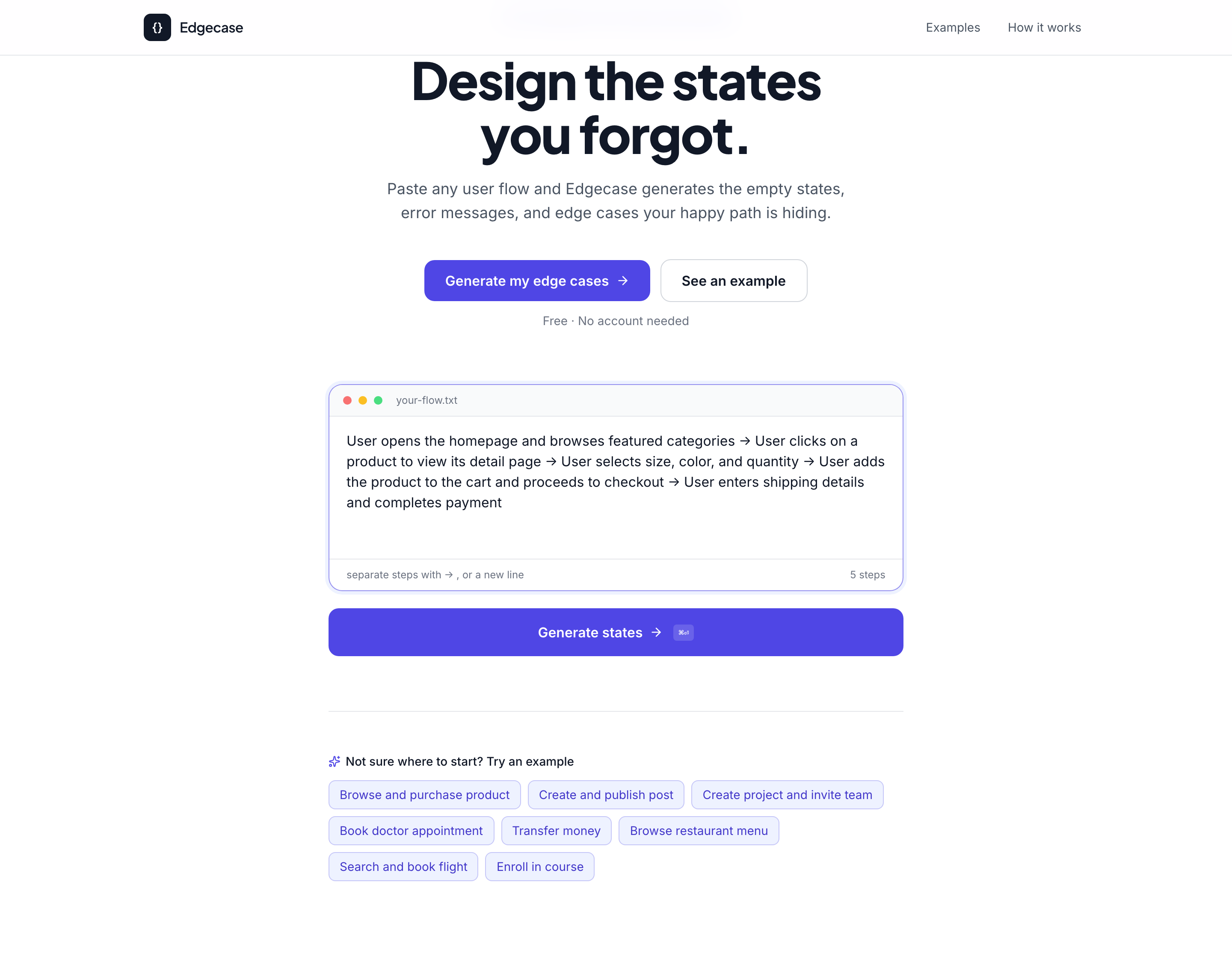
The first UX decision was about entry: how someone describes a flow without needing to learn a new syntax or tool. I designed the input as plain language - the way a designer would explain a flow to a teammate over Slack, not a structured form. As someone types, the description splits into individual numbered steps live, before anything is generated - a deliberate trust-building signal that the tool understood the flow correctly, before asking the user to wait for anything.
Designing the Results Experience
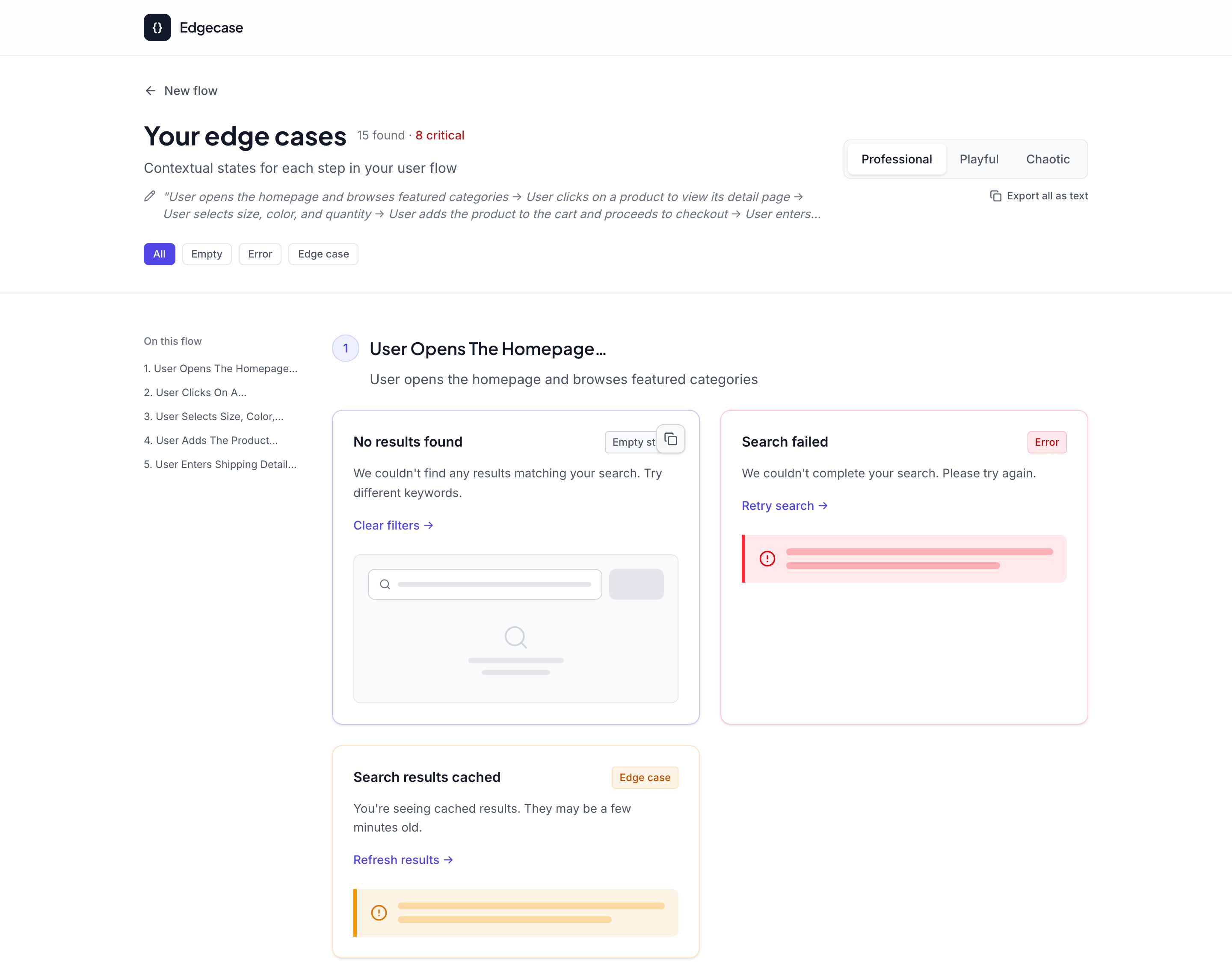
The core design challenge was information density. A single step in a flow - something as simple as "browse featured categories" - can actually break in multiple distinct ways. Most tools, and most designers working under time pressure, stop at the first obvious failure and move on. I designed the results view to resist that shortcut: each step returns multiple distinct state cards, not just the obvious error, but the quieter, easier-to-miss cases too - like content silently loading from a stale cache. Each card is visually categorised (Empty state / Error / Edge case) so a designer scanning the results can immediately triage by severity and type.
The Same Rigor at Every Step
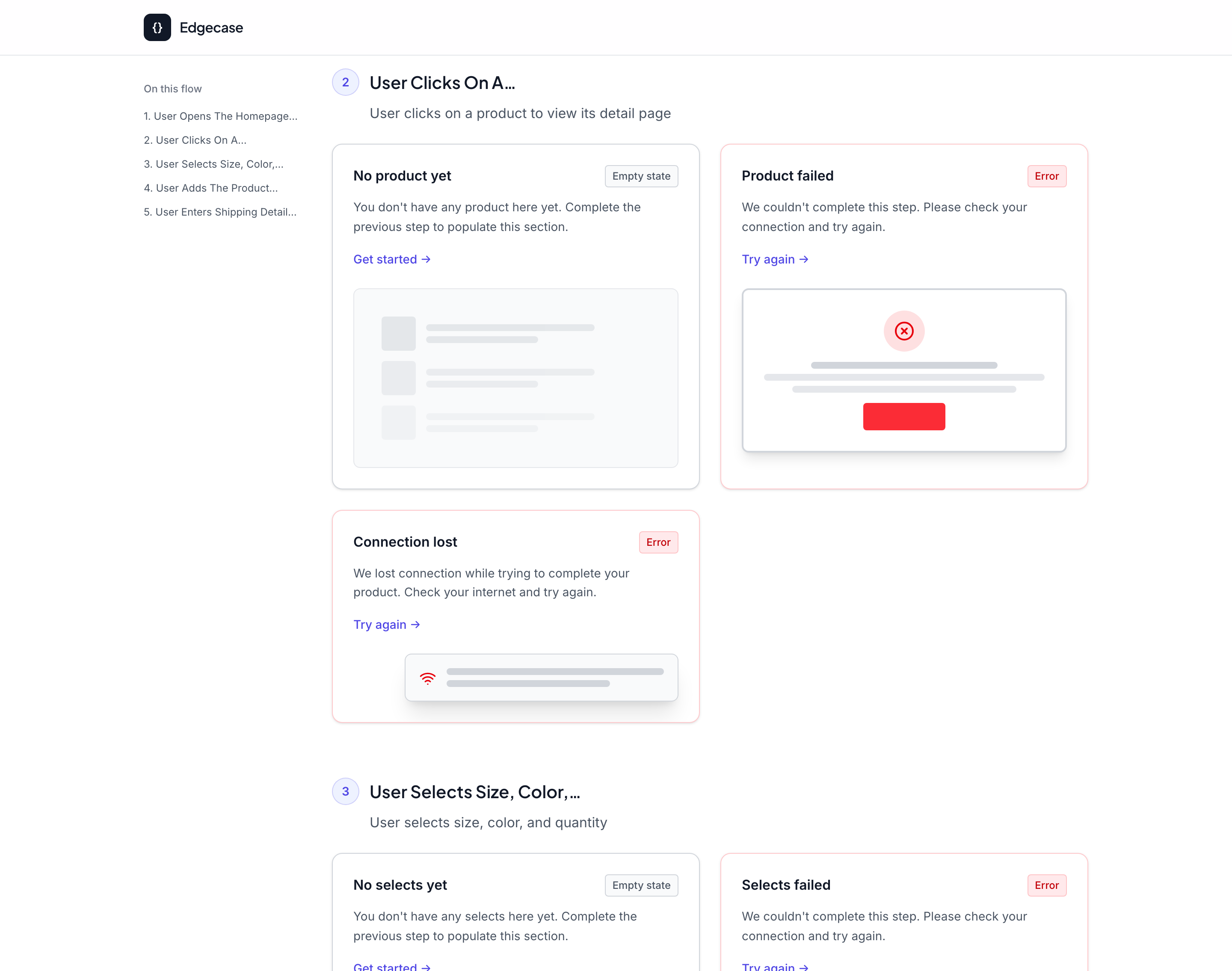
For a multi-step flow - I tested with a 5-step checkout - the same rigor applies at every step, not just the first. Each result card includes a small hand-designed visual mockup alongside the copy, with a "copy as image" control on hover so a specific state can be dropped directly into a working design file.
Outcome & Impact
One interaction decision I'm proudest of: a three-way tone toggle - Professional, Playful, and Chaotic - that changes the voice of every generated state instantly. Chaotic was the most deliberate choice. It's not a joke setting - it's a thinking tool. Teams have a natural tendency to wave off edge cases as "that would never happen." An intentionally exaggerated, worst-case tone makes those scenarios harder to dismiss, because absurdity draws attention rather than letting a case quietly disappear from consideration. A small but deliberate decision shaped the moment right before results appear: even though results return almost instantly, an immediate screen swap felt jarring and, honestly, untrustworthy. Rather than manufacturing a fake "AI thinking..." delay to seem more sophisticated than the tool actually is - a pattern I see often in AI products right now - I designed a brief, honest loading transition using skeleton screens shaped like the actual results layout. It respects the user's time without performing artificial intelligence for its own sake.
Technical Details
Flow Parsing & Classification
Splits a free-text flow description into discrete steps, then classifies each step into one of roughly 19 interaction categories using targeted keyword and regex matching against the step's verb and subject (e.g. "upload a photo" -> upload-media, "check out" -> commerce-checkout). Runs entirely client-side and resolves in milliseconds, with no external dependency or network round-trip.
Hand-Authored Content Library
Each of the ~19 categories has its own empty, primary-error, secondary-error, and edge-case copy, written individually rather than machine-translated between tones - roughly 150+ distinct strings in total. This was the actual bulk of the design work: deciding what realistically goes wrong at each step, then writing microcopy for it that holds together at scale.
Built with Claude Code as an AI Development Partner
The full React, TypeScript, and Tailwind CSS build - started in Figma Make for early rapid prototyping - was carried solo through a one-week hackathon using Claude Code as an AI-assisted development partner, at a pace solo development wouldn't otherwise allow. That's a deliberate separation worth naming: AI accelerated how the tool was built; it plays no role in what the tool generates at runtime.
Tone Customization
Three tone modes - Professional, Playful, and Chaotic - are implemented as a lookup against pre-written content rather than a new generation, so switching tones re-renders instantly with zero latency.
Honest Loading State
Generation itself resolves in milliseconds. Rather than an instant, jarring screen swap, the loading transition holds for a brief, deliberate pause using skeleton screens shaped like the results page - long enough to read as a genuine transition, short enough to never feel like a fake delay.
Lessons Learned
AI acceleration and AI output are two different design decisions - using Claude Code to build faster is not the same choice as using a live model to generate what users see, and conflating the two is a common mistake in current AI product design. Being deliberate about which one you're actually doing, and why, matters more than defaulting to "more AI."
Visual proof builds more trust than written description, AI-generated or otherwise - people believed a state was "handled" when they could see it, not when they could only read about it.
Speed changes behaviour, not just convenience - when checking edge cases takes seconds instead of a backlog ticket, people actually do it.
Tone is a design lever, not a cosmetic one - the Chaotic mode taught me that tone can intentionally change how seriously someone evaluates a scenario.
An honest UI beats a performative one, especially in AI products, where the temptation to manufacture the appearance of intelligence is constant - users notice, even subconsciously, when a delay is real work versus theatre.
Key Features
- Plain-language flow input with live step-by-step parsing feedback
- Built with AI-assisted development (Claude Code) for rapid solo shipping
- Multiple distinct states surfaced per step, not just the obvious one
- Visual mockup paired with every generated state, not just copy
- Three-tone system (Professional / Playful / Chaotic) for voice-matching
- One-click "copy as image" for direct use in design files
- Deliberately fast, predictable output - a conscious AI product design trade-off
- Honest, brief loading transition instead of manufactured "AI thinking" delay
- Designed and shipped solo in one week
Want to Collaborate?
I'm always interested in new experiments, research collaborations, and pushing the boundaries of AI design.