Designing Data Flow: A Multi-Platform Supply Chain Management System
Transforming a manual, paper-heavy forest produce supply chain into a unified digital ecosystem across mobile, web, and TV platforms
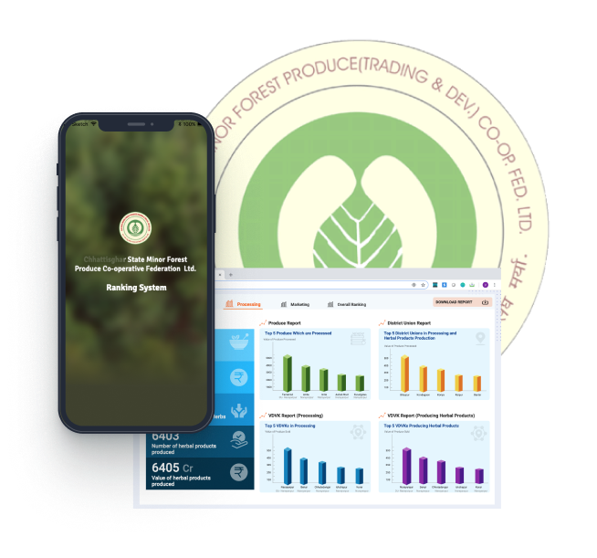
Executive Summary
As lead UX designer for this government digital transformation initiative, I spearheaded the design of a comprehensive multi-platform supply chain management system that digitized the entire forest produce workflow for a state government department.
The project required navigating complex stakeholder ecosystems, designing for extreme user diversity (from rural collectors with limited literacy to senior government officials), and creating a unified data architecture that could scale across mobile, web, and public display platforms.
Business Impact
This wasn't just a digitization project — it was a fundamental transformation of how government supply chains operate, demonstrating that thoughtful UX strategy can turn data flow into decision flow, improving efficiency while building public trust.
My Role & Contributions
UX Research & Strategy: Led field research across 12 collection points, conducted 45 stakeholder interviews, and developed the core UX strategy for multi-platform data flow architecture
Information Architecture: Designed the end-to-end information architecture that unified three distinct platform experiences while maintaining data consistency and platform-appropriate interaction patterns
Cross-Functional Leadership: Partnered with government stakeholders, development teams, and field officers to align technical constraints with user needs and policy requirements
Design System Creation: Built a comprehensive multi-platform design system with 47 components, supporting 8 languages and three distinct platform paradigms
14 months (Research: 2 months, Design: 8 months, Implementation support: 4 months)
Cross-functional team of 12 (1 UX designer, 6 developers, 2 product managers, 3 government liaisons)
Mobile (Android), Web (Responsive), TV Display (Public kiosks)
2,500+ rural collectors, 150+ field officers, 50+ admin users
Strategic Approach: Designing for Complexity
This project presented a classic UX leadership challenge: how do you design a single system that serves users with fundamentally different needs, capabilities, and contexts? My strategic approach centered on three key principles:
One Data Model, Many Views
Rather than building three separate systems, I architected a unified data model with platform-specific presentation layers. This ensured consistency while respecting each platform's unique constraints.
Context-Driven Complexity
I rejected universal simplicity in favor of appropriate complexity: extreme simplicity for mobile collectors, moderate density for web operators, and high-level clarity for public displays.
Trust Through Transparency
Designed visibility layers so collectors could verify their data, officers could track workflows, and the public could see government accountability — building trust at every level.
Design Leadership Challenges
As the sole UX designer on a complex government project, I navigated several leadership challenges beyond traditional design execution:
Navigated competing priorities between government administrators (comprehensive data), field officers (operational efficiency), and rural collectors (extreme simplicity). Created alignment by framing the solution around shared transparency goals rather than feature lists.
Worked closely with development team to understand API limitations, offline sync constraints, and TV display boundaries. Translated these constraints into design opportunities (e.g., offline-first became a core feature, not a compromise).
Championed user needs within rigid government policy frameworks. Successfully advocated for photo-based verification and smart defaults despite initial resistance from policy stakeholders who preferred traditional form-based approaches.
Strategic Trade-Offs & Decision Framework
Every design decision involved trade-offs. Here's how I approached key strategic decisions:
Chose: Platform-specific designs sharing design tokens
Rationale: A single UI would have compromised all three experiences. Mobile needed touch-optimized minimal interfaces; web needed data tables; TV needed glanceable information.
Chose: Context-appropriate features
Rationale: Each platform got features that made sense for its context: mobile (offline-first), web (bulk operations), TV (auto-rotating dashboards).
Chose: Intuition-driven with targeted training
Rationale: Budget constraints couldn't support extensive training. Designed for maximum intuitiveness through visual cues and progressive disclosure.
Chose: Full 8-language support from day one
Rationale: Research showed language barriers would prevent adoption. Designed flexible layouts for text expansion despite development complexity.
The Challenge
The State Forest Department managed the collection and distribution of forest produce through an entirely paper-based system. This manual process created significant bottlenecks, data inconsistencies, and delays in decision-making that affected thousands of rural collectors and government operations.
The department needed to track produce from collection points in remote rural areas through processing centers to final distribution, while maintaining transparency and accountability across multiple stakeholder levels. The paper-based system made real-time visibility and data-driven decision-making nearly impossible.
From rural collectors with limited digital literacy to government administrators requiring executive dashboards
Mobile for field data capture, web for officers, and TV displays for public transparency
Support for 8 regional languages to serve diverse rural communities
Managing complex supply chain data while keeping interfaces simple and intuitive
Research & Discovery
I conducted extensive field research to understand the existing workflows, pain points, and needs of all stakeholders in the supply chain — from rural collectors to government administrators.
Research Approach
Visited 12 collection points and processing centers to observe current paper-based workflows and understand environmental constraints (connectivity, lighting, workspace conditions)
Conducted 45 interviews across all user groups: forest produce collectors, field officers, processing center managers, and department administrators
Evaluated technology comfort levels and smartphone usage patterns among rural collectors to inform interface complexity decisions
Mapped complete supply chain workflow from collection to distribution, identifying pain points, handoffs, and data requirements at each stage
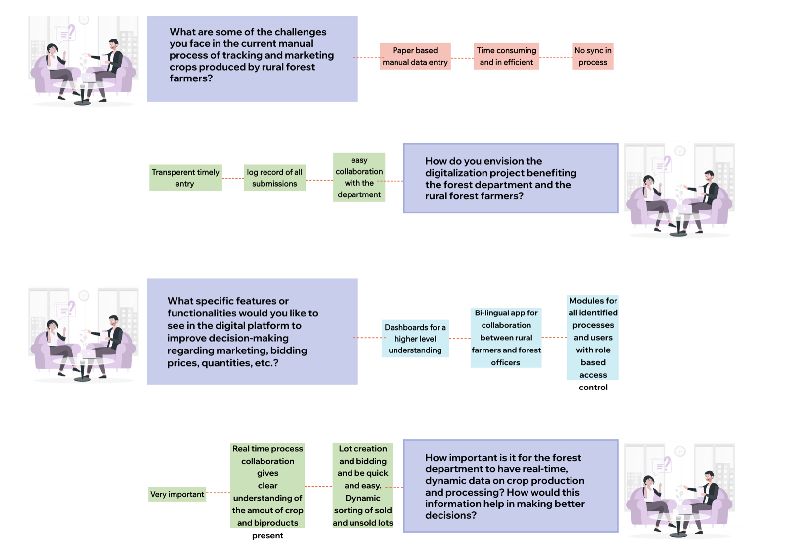
Critical Insights
Collectors needed simple form entry with minimal fields, officers required operational tracking with moderate detail, and administrators needed comprehensive dashboards with analytics — all from the same data system.
Many collectors were more comfortable reading in their regional language than in English or Hindi. Interface language needed to extend beyond just labels to include error messages, help text, and validation feedback.
Collectors wanted to see their data was recorded correctly, officers needed audit trails, and administrators required public-facing displays to demonstrate accountability. The system needed visibility into the same data at different abstraction levels.
User Personas
Based on research, I developed three primary personas representing different system users:
Needs simple mobile interface with minimal text entry, local language support, and offline capability
Requires operational tracking tools, approval workflows, and real-time visibility into collection activities
Needs comprehensive analytics dashboards, reporting tools, and system-wide visibility for strategic planning
UX Strategy & Design Solutions
I developed a unified design strategy that created a consistent data flow across three distinct platform experiences, each optimized for its specific user context and device constraints.
Information Architecture & Data Flow Design
The core design challenge was creating a single data model that could serve three very different interfaces. I designed a hierarchical information architecture that allowed each platform to access appropriate data layers while maintaining consistency.
Rather than creating separate systems, I designed a single data structure with three presentation layers: simplified mobile forms, operational web dashboards, and high-level TV displays. This ensured data consistency while optimizing each experience for its users.
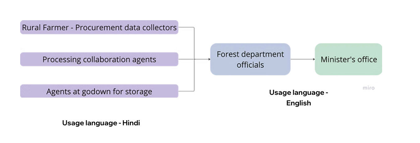
Minimal fields, smart defaults, offline sync
Workflows, tracking, approvals, reports
High-level metrics, transparency dashboards
Mobile Platform: Field Data Capture
The mobile interface was designed for rural collectors with varying digital literacy levels, often working in areas with poor connectivity and challenging environmental conditions.
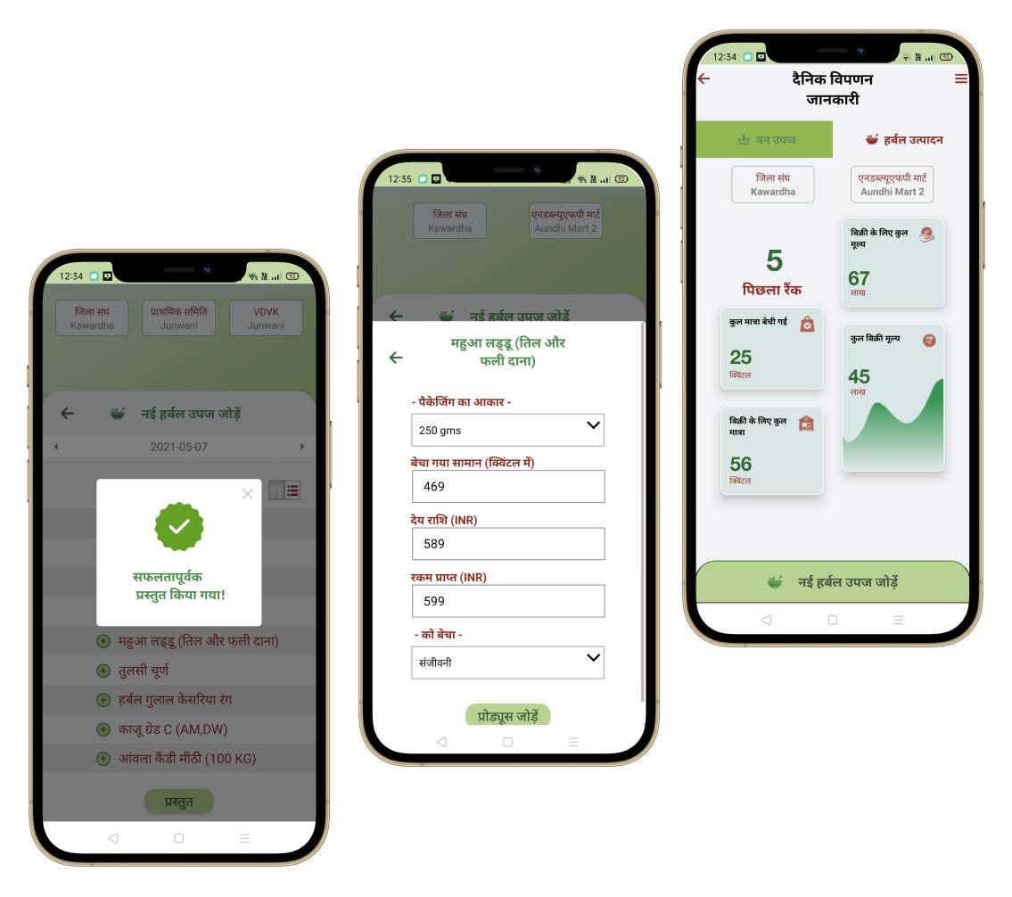
Mobile Design Principles
Reduced cognitive load by showing only essential fields initially, with common values pre-filled based on user location and history
Minimized text entry by using photo capture for produce verification, dropdown selections for categories, and number pads for quantities
Designed for complete offline functionality with clear sync status indicators and conflict resolution workflows
Full interface translation in 8 regional languages with culturally appropriate iconography and visual cues
Web Platform: Operational Management
The web interface served field officers and processing center managers who needed to track operations, approve transactions, and generate reports.
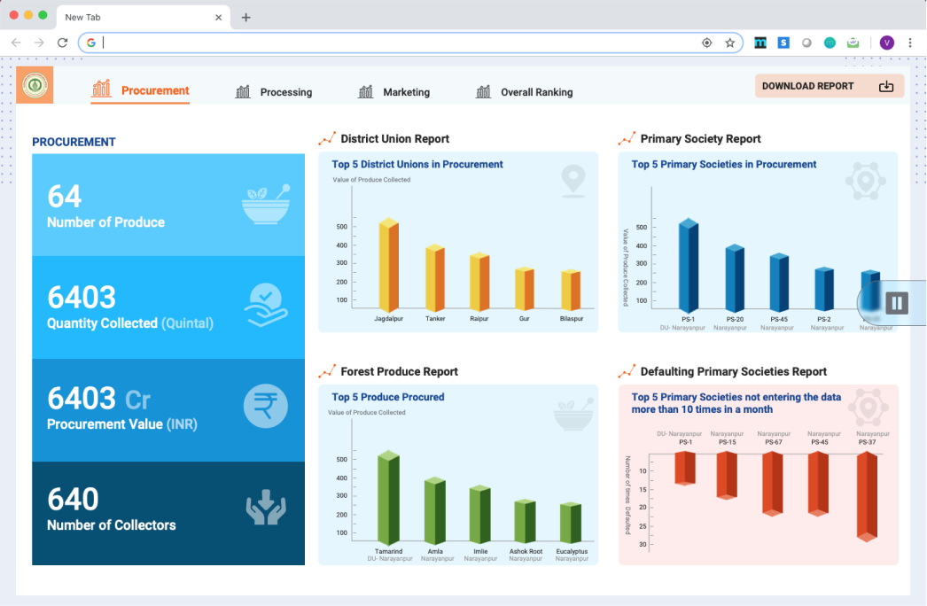
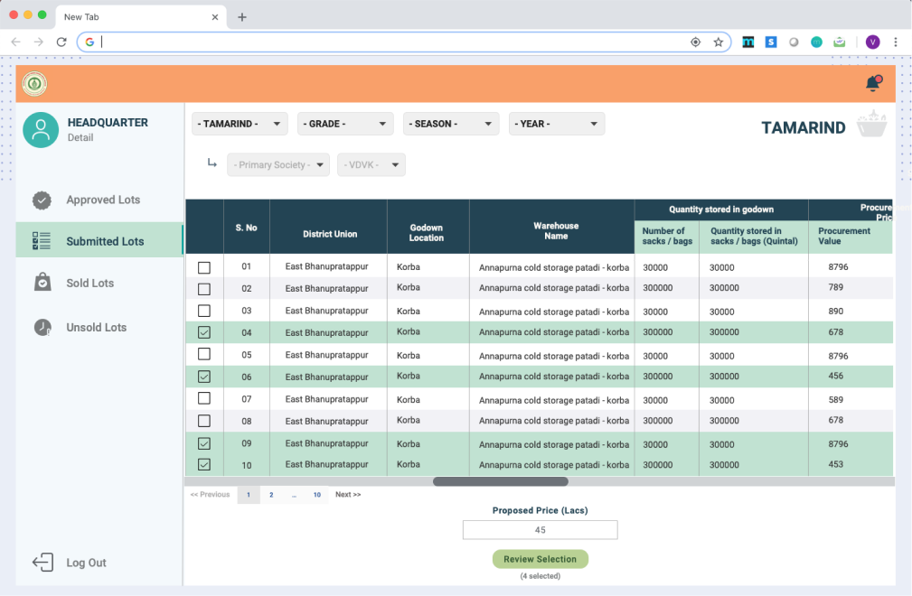
Web Platform Features
Live tracking of collection activities, pending approvals, and processing status across all collection points
Designed approval workflows with clear action queues, verification steps, and audit trail documentation
Multi-criteria filtering, saved searches, and custom report generation for operational analysis
Anomaly detection, data quality indicators, and correction workflows to ensure data integrity
TV Display: Public Transparency Dashboard
TV displays in public areas showed high-level metrics to demonstrate transparency and accountability to stakeholders and the general public.
TV Display Design Approach
Large typography, high contrast colors, and simplified metrics designed to be understood from a distance
Automatic cycling through key metrics, regional breakdowns, and trend visualizations without user interaction
Used charts, maps, and infographics to communicate complex supply chain data in accessible visual formats
System Information Architecture
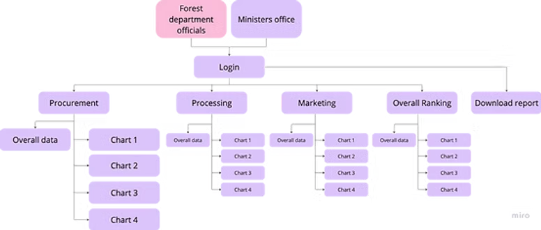
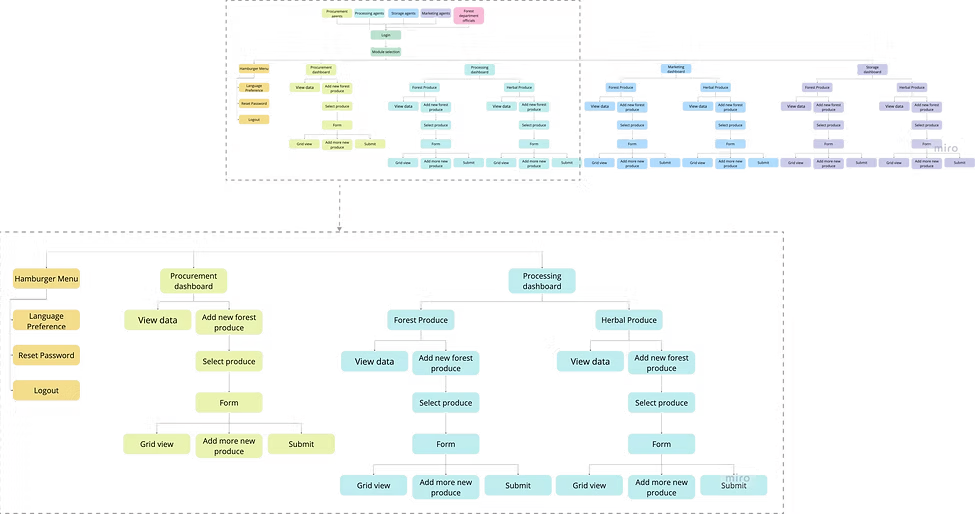
The following diagrams showcase the complete information architecture across different views — from high-level module structure to detailed navigation flows and screen hierarchies.
Module Hierarchy & Dashboard Structure
Shows the top-level structure for Forest department officials and Minister's office users, with five main modules (Procurement, Processing, Marketing, Overall Ranking, and Download report), each containing multiple data visualizations and charts.
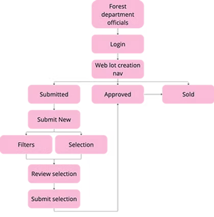
User Workflow & Navigation Structure
Details the workflow navigation for forest department officials, including lot creation processes with submission, approval, and sales workflows, showing how users navigate through different states and actions.
Detailed Screen Architecture
Comprehensive view of the complete screen architecture including the hamburger menu navigation, procurement dashboards, and processing dashboards with their respective data views, forms, and actions for both forest produce and herbal produce workflows.
Architecture Design Principles
Modular Organization: The architecture is organized into clear modules (Procurement, Processing, Marketing) that mirror the real-world supply chain workflow, making it intuitive for users to find the functionality they need.
Progressive Depth: Information is structured in layers, from high-level dashboards to detailed data views and forms. Users can drill down progressively without getting overwhelmed by complexity.
Parallel Workflows: Separate but consistent workflows for different produce types (forest vs. herbal) maintain familiar patterns while accommodating different data requirements.
State-Based Navigation: The workflow architecture clearly defines different states (Submitted, Approved, Sold) with appropriate actions available at each stage, preventing confusion and errors.
Design System & Multi-Platform Consistency
Creating a unified design system that worked across mobile, web, and TV platforms while adapting to each platform's unique constraints and interaction patterns was essential for system coherence.
Cross-Platform Design System
I developed a comprehensive design system with platform-specific implementations while maintaining visual and conceptual consistency:
Accessibility & Localization
Designed a translation system that supported 8 regional languages with proper text expansion handling, RTL support considerations, and culturally appropriate visual elements. Created component variants that adapted layout based on text length variations across languages.
Incorporated icons, color coding, and visual cues alongside text to support users with varying literacy levels. Conducted usability testing with actual collectors to validate that visual communication was clear and culturally appropriate.
Delivered a comprehensive design system with 47 components, 12 platform-specific patterns, and detailed documentation for the development team. This ensured design consistency as the system scaled to additional features and use cases.
Results & Impact
The multi-platform supply chain management system successfully digitized the entire forest produce workflow, creating measurable improvements in efficiency, transparency, and data quality.
Complete elimination of paper-based processes across all collection points
From data collection to approval and payment processing
Seamless data flow across mobile, web, and TV interfaces
Measured Outcomes
Operational Impact
Faster data flow and automated approvals significantly reduced time to payment for rural collectors
"This system has transformed how we manage forest produce collection. What used to take weeks of manual paperwork now happens in real-time. Most importantly, our collectors trust the system because they can see their data being recorded correctly."— Department Administrator, State Forest Department
System Scalability
The design system and platform architecture have been adopted as a model for digitizing other government supply chain operations:
- • Extended to 3 additional state forest departments
- • Design patterns adapted for agriculture produce tracking system
- • Multi-platform approach documented as best practice for rural-to-urban data flow systems
Reflections & Lessons Learned
What Made This Project Successful
Deep field research: Spending time in actual collection centers and observing paper-based workflows was crucial. It revealed constraints and needs that wouldn't have emerged from office-based interviews alone.
User-centered multi-platform strategy: Rather than creating identical experiences across platforms, I designed each interface for its specific user context while maintaining data consistency. This approach served diverse users without compromise.
Progressive rollout with user training: Phased deployment with hands-on training sessions for collectors ensured high adoption rates despite varying digital literacy levels.
Challenges & How I Overcame Them
Challenge: Designing for users with low digital literacy and limited smartphone experience.
Solution: Conducted multiple rounds of usability testing with actual collectors, iteratively simplifying the interface based on observed pain points. Incorporated visual cues and minimized text entry to reduce cognitive load.
Challenge: Ensuring offline functionality in areas with unreliable connectivity.
Solution: Designed clear offline/online status indicators and sync workflows. Created conflict resolution flows that made sense to users when offline data needed to be reconciled with server data.
Challenge: Balancing data density requirements across very different user needs.
Solution: Developed a layered information architecture where each platform accessed appropriate data depth. Mobile showed minimal essential fields, web provided operational detail, and TV displayed high-level aggregates.
What I'd Do Differently
- Start user training earlier in the development process rather than waiting for final build
- Create more video-based training materials for collectors who found written documentation challenging
- Build analytics tracking into the initial release to gather usage data from day one
- Involve more field officers in the design process earlier to identify workflow edge cases
Key Takeaway
Effective data flow design isn't about creating a single perfect interface — it's about understanding that different users need different views into the same data. By designing platform-specific experiences that shared a unified data model, we transformed a complex supply chain into an intuitive multi-platform ecosystem. The success of this project demonstrated that with thoughtful UX, even the most complex government processes can become accessible, transparent, and efficient.
More Case Studies
AI Restaurant Management SaaS
Designing the 'seam' between AI and humans for predictive restaurant operations
Read Case StudyPanna Personality Assessment
Designing the human-AI seam for an AI-powered recruitment tool that automates personality assessments while earning trust through explainability and empathy
Read Case Study